A modern logo and identity is crucial in a world where people make judgements increasingly quickly based on what they see on the outside. Here are some examples of new estate agency logo designs we’ve done.

Aston Rowe, London W3
Aston Rowe were a newish agency when we started working with them in 2013. Although their logo was already designed, we introduced the idea of using the ‘ar’ of their logo in words that applied to their business, in order to increase awareness of their brand. Now they’ve opened as second office in Brook Green, that is coming into its own again.

Brand Vaughan, Brighton
They came to us for a quick refresh, but after we’d inspired them with some different options, decided on a complete overhaul of their brand identity, as well as their service offering.

Robert Williams, Exeter
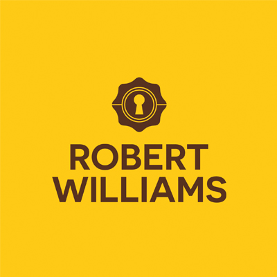
Robert Williams wanted to re-position themselves as a more established agency, following years of a more ‘consumer’ brand. The identity we created for them introduces some items associated with heritage and professionalism such as the seal and the key, along with a new colour scheme, typeface and strapline.

Complete Estate Agents, south Devon
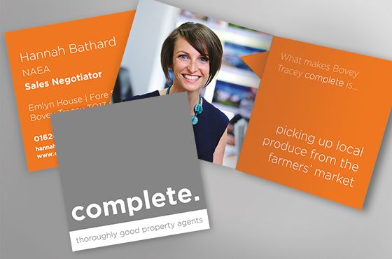
The directors of Complete felt their estate agents needed a new logo and visual identity. We wouldn’t agree just for the sake of it, but on this occasion we did. In tandem with redefining their proposition to one of ‘completeness of service’ (read the case study), we redesigned the logo in support of that proposition. ‘Complete’ always appears within a box to emphasise its ‘wholeness’ and topped off with a strapline: ‘thoroughly good property agents’.

Cooper Adams, West Sussex
Following a change of partners, Shaun Adams wanted to update their identity and reposition themselves more upmarket. By using a nice ‘handscript’ typeface, we were able to build on the proposition that we had developed with them, which was to bring out the personal, boutique-style service and attention that clients receive from Cooper Adams. The darker colours also helped with the upmarket positioning.

Roger Hemming, Devon
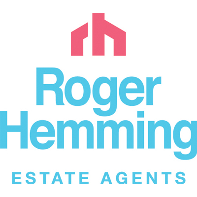
Roger Hemming felt his identity needed updating. We designed a logo which introduced a fresh yet warm colour palette as well as a clever shaping of the letters R and H…